
Quality APP
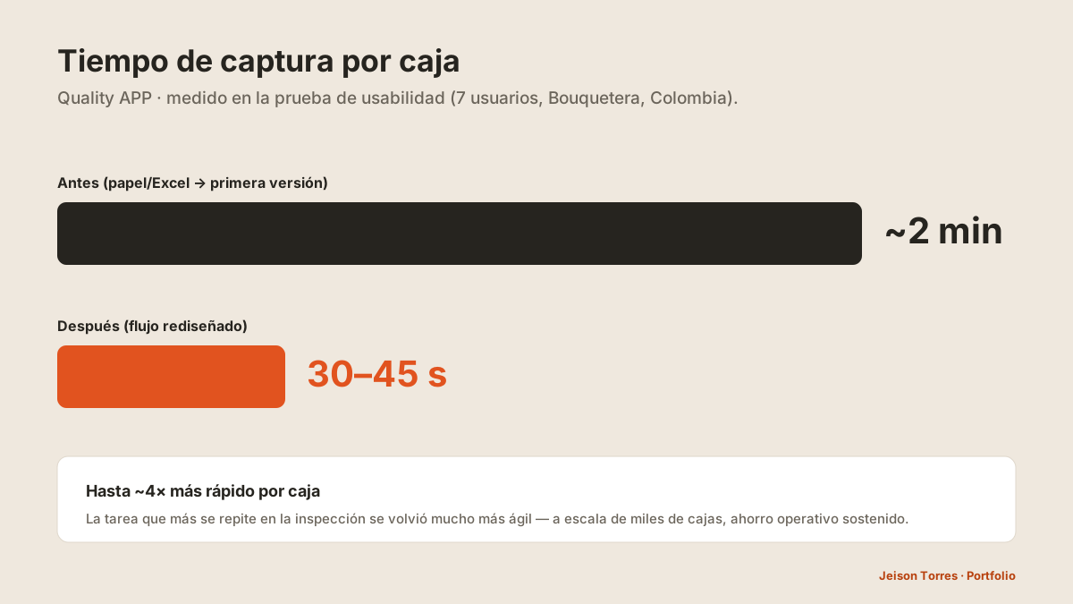
De 2 minutos por caja a 30–45 segundos, y un sistema de calidad para tres unidades de negocio.
Tiempo por caja medido en prueba de usabilidad formativa con 7 usuarios (antes de escalar) · las correcciones se aplicaron en los 3 módulos.
El problema
La inspección de calidad se registraba en papel y Excel: lento y sin trazabilidad. Un mismo producto pasa por tres unidades de negocio que lo miran distinto (Finca, Comercializadora, Bouquetera); al digitalizar, la captura seguía siendo lenta y la app no respetaba cómo se inspecciona de verdad en la operación.
Mi rol · equipo · organización
Lideré el diseño desde la investigación: enfoque, arquitectura de los tres módulos, flujos, feedback continuo al prototipo, y moderación de las pruebas de usabilidad. Interpreté los hallazgos y definí los cambios.
Un diseñador de mi equipo construyó el prototipo bajo mi dirección; otro me acompañó a correr la prueba y tomar notas.
GHT definió los criterios de calidad de cada unidad de negocio y el despliegue.
Research
Pruebas de usabilidad formativas con 7 usuarios en la Bouquetera (Colombia), antes de escalar, combinando tarea real de inspección con observación contextual.
- La captura por caja tardaba ~2 minutos.
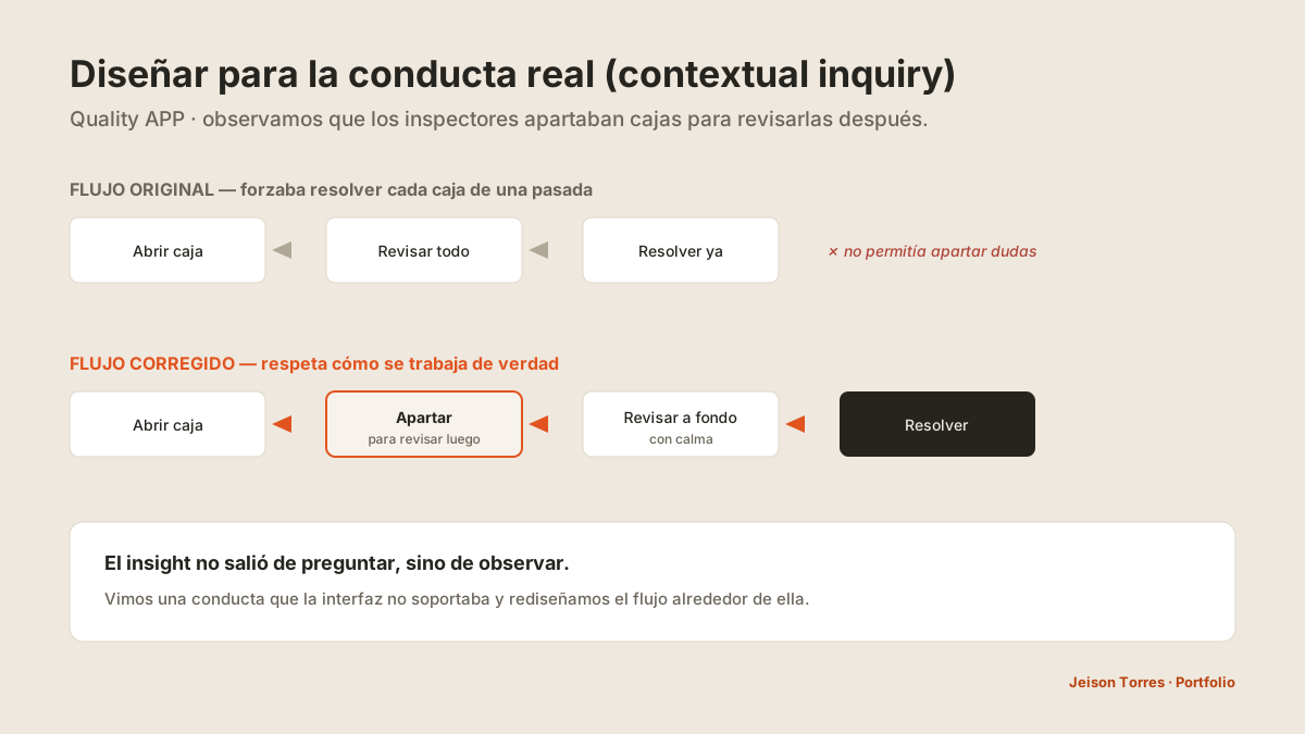
- Los usuarios apartaban ciertas cajas para revisarlas después — el flujo original no lo permitía.
- No encontraban el código de hardgoods en el CheckList de Finca.
Observando (no preguntando) vi que los inspectores apartaban cajas dudosas para revisarlas a fondo después, en vez de resolver cada caja de una sola pasada. Rediseñé el flujo para acompañar esa conducta real: apartar → revisar a fondo → resolver.
Insights
- La velocidad de captura es la métrica que la operación siente.
- Diseñar para la conducta real, no para el flujo ideal.
- El conocimiento no debe vivir en la cabeza del inspector — debe estar a un toque.
Evidencia visual
3 módulos + transformación
Decisiones de diseño
Acelerar la captura
Rediseñé el flujo de captura por caja: menos pasos y datos mejor dispuestos para la tarea (~2 min → 30–45 s).
Respetar la conducta real
El flujo permite apartar cajas y revisarlas a fondo después, en vez de forzar resolver todo de una pasada.
Ayuda en contexto
Ícono junto al código de hardgoods que despliega su significado — sin salir de la tarea.
Un sistema, tres módulos
Quality Control (Finca), Quality Control BQT (Bouquetera) y CheckList (Comercializadora), con patrones de interacción compartidos.
Resultados
Aprendizajes
- Observar vence a suponer.
- La velocidad es UX medible.
- Diseñar sistemas, no pantallas sueltas.
Quality APP
From 2 minutes per box to 30–45 seconds, and one quality system for three business units.
Per-box time measured in a formative usability test with 7 users (before scaling) · fixes applied across all 3 modules.
The problem
Quality inspection was recorded on paper and Excel: slow and with no traceability. The same product goes through three business units that look at it differently (Farm, Trading, Bouquet); when digitizing, capture was still slow and the app did not respect how inspection really happens in the operation.
My role · team · organization
I led the design starting from research: approach, architecture of the three modules, flows, continuous feedback on the prototype, and moderation of the usability tests. I interpreted the findings and defined the changes.
A designer from my team built the prototype under my direction; another helped me run the test and take notes.
GHT defined the quality criteria of each business unit and the rollout.
Research
Formative usability tests with 7 users at the Bouquet unit (Colombia), before scaling, combining a real inspection task with contextual observation.
- Capture took ~2 minutes per box.
- Users set some boxes aside to review later — the original flow did not allow it.
- They could not find the hardgoods code in the Farm CheckList.
By observing (not asking) I saw that inspectors set doubtful boxes aside to review them in depth later, instead of resolving each box in a single pass. I redesigned the flow to support that real behavior: set aside → review in depth → resolve.
Insights
- Capture speed is the metric the operation feels.
- Design for real behavior, not the ideal flow.
- Knowledge should not live in the inspector's head — it should be one tap away.
Visual evidence
3 modules + transformation
Design decisions
Speeding up capture
I redesigned the per-box capture flow: fewer steps and data better laid out for the task (~2 min → 30–45 s).
Respecting real behavior
The flow lets users set boxes aside and review them in depth later, instead of forcing everything to be resolved in one pass.
Contextual help
An icon next to the hardgoods code that unfolds its meaning — without leaving the task.
One system, three modules
Quality Control (Farm), Quality Control BQT (Bouquet) and CheckList (Trading), with shared interaction patterns.
Results
Learnings
- Observing beats assuming.
- Speed is measurable UX.
- Design systems, not isolated screens.